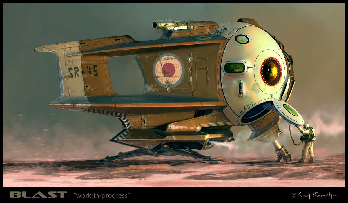


Based on what I'm reading on my FB page what about these new options. (the single images)
Any thoughts on which color palette works the best are most welcome.
Cheers.
And a big thanks to those of you who have already signed up for my Red Engine studios weekend workshop in October.


7 comments:
I'd go for the middle one. But you're the boss :)
I say the top one.
Lol, I swear this is not on purpose but I'm digging the bottom most pallet. My eyes feel like they can rest on the right spots and understand the shapes better.
I like the bottom one. It feels like the pilot is on a cold planet.
Thanks All,
I've tried combining the top and bottom into the two versions at the top of the post. I think I'm getting closer.
Nice. I think you'll get some tasty mood going with the colors from the bottom (of the two new ones) with some of the orange light from the top just hitting key point on the ship. The landscape colors on the bottom one (especially) feel more mysterious and intriguing (to me). Looking good!
Beautiful! I like the bottom one. And when does the the diecast model with action figures version come out? !! :)
Post a Comment